The only way I have discovered how to fix the iMessage “Waiting for Activation” Error :(

Image


Las week, I installed the beta release of iOS 7. I have an iPhone 4 in good shape and I decided to keep up with the upgrade.

Everything went just fine. The system seems a little bit like a mix between Android and Windows and something in the middle, but it is ok.. I mean, is just a beta..

Anyway, I noticed that the battery was drawing down faster than with the version 6.1.3. I have experienced several crashes but again.. I keep saying to my self: IT IS JUST A BETA!!!

The problem with iMessage came to me when I just activated the Airplane Mode. Weird uh? After turning off the Airplane Mode, I started noticing my messages were green instead of blue and I went to setting panel > iMessage and I realized the option was turned off. And when I tried to turn it on I have the annoying message:

“Waiting for activation”

And nothing more! And also when I hold the button to turn iMessage (or Facetime) on, it crashes back to the home screen.

I tried a lot of the solutions already posted over the Internet, but nothing helped me out. So I decided to erase all content and settings from the iPhone’s settings. The just setup the iPhone from my backup (I make periodically backups on iCloud and on my computer.. just in case.. and this time was the case! ) and it seems to have fixed the problem.

It is a shame that this kind of extreme solutions have to happen with iOS. I know that no system is reliable and perfect but the expectations on iOS 7 were really high.

So my conclusion is:

1) Always make a backup!
2) Erase and Restore your settings. D’ont erase the content, just the settings. (Settings > General > Reset > Reset all Settings)

If you know any other (and no so drastic) way, please let me know.

Be grateful with what you have and fearless with what you want.. Stop criticizing and start working in you from inside to express it outside..

How to do an accordion effect to quick launch menu with jQuery in Sharepoint 2010

This is the code I used to do an accordion effect to the quick launch menu in Sharepoint designer with jQuery. Also, you have to put this code in your Portal Master Page in order to see the changes applied. In my case, I have a separate Javascript file where all custom functionality is concentrated.

CSS code:


.imgAlign
 {
 padding-right:9px;
 padding-top:6px;
 padding-bottom:3px;
 }
.imgTrnspAlign
 {
 padding-right:10px;
 }

jQuery Code:

$(document).ready(function ()
{

    // Put the arrow images for the elements with children. 
    $("div.menu-vertical>ul.root>li.static>a").each(function ()
    {
        var hasChild = $(">ul", $(this).parent()).html();

        if (hasChild != null)
        {
            $(this).find("span.menu-item-text").prepend("<img src='../Images/plusArrow.png' border='0' class='imgAlign' />");
        
        } else {
        
             $(this).find("span.menu-item-text").prepend("<img src='../Images/transparentArrow.png' border='0' class='imgTrnspAlign' />");


        }

    });


    // This function activates the arrow functionality to toggle the submenu elements. The header (father item) is a link it self. You may be want to consult this link, so the functionality is only for the arrow image.

    $("img.imgAlign").toggle(

    function ()
    {
        $("img.imgAlign").attr('src', '../Images/plusArrow.png');
        $(this).attr('src', '/_layouts/AGCOCorpBranding/Portal.master/Images/minusArrow.png');
        if ($(this).parent().parent().parent().parent().html().indexOf('none') &gt; -1)
        {
            $("div.menu-vertical&gt;ul.root&gt;li.static&gt;ul.static").css("display", "none");
            $("&gt;ul", $(this).parent().parent().parent().parent()).show("fast");
            $(this).attr('src', '../Images/minusArrow.png');
        }
        else
        {
            $("div.menu-vertical&gt;ul.root&gt;li.static&gt;ul.static").css("display", "none");
            $("&gt;ul", $(this).parent().parent().parent().parent()).hide("fast");
            $(this).attr('src', '../Images/plusArrow.png');
        }
    }, function ()
    {
        if ($(this).parent().parent().parent().parent().html().indexOf('none') &gt; -1)
        {
            $("div.menu-vertical&gt;ul.root&gt;li.static&gt;ul.static").css("display", "none");
            $("&gt;ul", $(this).parent().parent().parent().parent()).show("fast");
            $(this).attr('src', '../Images/minusArrow.png');
        }
        else
        {
            $("div.menu-vertical&gt;ul.root&gt;li.static&gt;ul.static").css("display", "none");
            $("&gt;ul", $(this).parent().parent().parent().parent()).hide("fast");
            $(this).attr('src', '../Images/plusArrow.png');
        }
    });


     $("div.menu-vertical&gt;ul.root&gt;li.static&gt;ul.static").css("display", "none");
 
    var s = $("div.menu-vertical&gt;ul.root&gt;li.static&gt;ul.static&gt;li.selected").parent();
    var p = s.parent();
    var img = p.find('img');
    img.attr('src', '../Images/plusArrow.png');
    p.find('ul').css("display", "none");
 
   
   // When you are in a child link page the menu is still showing with the child element highlighted.

     if ( $("div.menu-vertical&gt;ul.root&gt;li.static&gt;ul.static").children().hasClass("selected")) {
           $("div.menu-vertical&gt;ul.root&gt;li.static&gt;ul.static li.selected").parent().css("display",""); 
        img.attr('src', '../Images/minusArrow.png');
 

    } else {
    
        $("div.menu-vertical&gt;ul.root&gt;li.static&gt;ul.static").css("display", "none");
    
    }


});
   

These are the images files I used in this implementation:
transparentArrow.png
plusarrow.png
minusarrow.png

References and credits:

How to convert string to Proper Casing in XSLT

We need first to make a xsl template to prepare the function of proper case:

<xsl:template name="TitleCase">
<xsl:param name="text" />
<xsl:param name="lastletter" select="' '"/>
<xsl:if test="$text">
<xsl:variable name="thisletter" select="substring($text,1,1)"/>
<xsl:choose>
<xsl:when test="$lastletter=' '">
<xsl:value-of select="translate($thisletter,'abcdefghijklmnopqrstuvwxyz','ABCDEFGHIJKLMNOPQRSTUVWXYZ')"/>
</xsl:when>
<xsl:otherwise>
<xsl:value-of select="$thisletter"/>
</xsl:otherwise>
</xsl:choose>
<xsl:call-template name="TitleCase">
<xsl:with-param name="text" select="substring($text,2)"/>
<xsl:with-param name="lastletter" select="$thisletter"/>
</xsl:call-template>
</xsl:if>
</xsl:template>

The we have to invoke a xsl variable to call the template just like this:

<xsl:variable name="CapNameSite">
<xsl:call-template name="TitleCase">
<xsl:with-param name="text" select="translate(normalize-space($noDashed), 'ABCDEFGHIJKLMNOPQRSTUVWXYZ','abcdefghijklmnopqrstuvwxyz')" />
</xsl:call-template>
</xsl:variable>

And we can use the variable just like this:

<div class="title">
<xsl:value-of select="$CapNameSite"/>
</div>

How to dynamically change the anchor href within a div element using jQuery and javascript.

The task was changing the href values from anchor elements inside a div. These anchor elements has relative links, for example:

/home/organization.html

/company/about_us.html

The idea is the add a global variable called “portalUrl” (which conatins the current URL from the site) before these values to make these links seems absoulutes:

portalUrl="http://thesite.com";

Final result:

http://thesite.com/home/organization.html

http://thesite.com/company/about_us.html

Other requirement was if the relative link had the string “TeamSites.aspx” the global value should be “workspaceUrl”:

workspaceUrl="http://workspace.thesite.com";

Image

This is the code using jQuery:

 $j('#my_footer a').each(function (value) {
var anchor = $j(this);
var current = anchor.attr('href');
var tsitesUrl = 'TeamSites.aspx';
if (current.indexOf(tsitesUrl) < 0) {
anchor.attr('href', portalUrl + current);
} else {
anchor.attr('href', workspaceUrl + current);
}
});

I noticed that this piece of code was not working correctly in Safari and Internet Explorer (7,8 and 9). After extensive research I found that the function “attr” from jQuery has a weird behavior with these browser. So, the solution was to translate the jQuery function into a javascript function:

var myfooter = document.getElementById("my_footer");
var allanchors = myfooter.getElementsByTagName("a");
var tsitesUrl = 'TeamSites.aspx';

for (var i = 0; i < allanchors.length; i++) {
var link = allanchors[i];
var hrefs = link.getAttribute("href");

if (hrefs.indexOf("http") < 0) { //this leave the absolute links out in case they exist.
    if (hrefs.indexOf(tsitesUrl) < 0) {
        link.href = portalUrl + hrefs;
    } else {
        link.href = workspaceUrl + hrefs;
    }
} //if http
} // for

how to force link from iframe to be opened in the parent window

I was facing a little issue regarding some links from iframe web part. I needed to open the link in the same parent page, instead of open it in a new page.

So I did an extensive research and I found the best solution was to use the base tag. Add the following to the head of the page in the iframe:

<base target=”_parent” />

This will load all links on the page in the parent window.

If you want your links to load in a new window, use:

<base target=”_blank” />

Implementing a mobile site and slide transition effects in page navigation with jQuery Mobile

I needed to create a mobile site for mobile devices such blackberry, iphone and android. I really wanted to make this site special and one special thing that came to my mind was the sliding effects between pages to make the navigation fancy and nicer (just like the default transitions in iPhone). But, after looking for a really long time I couldn’t find something better than jQuery Mobile framework (http://jquerymobile.com/). It has cool transition effects and the GUI is already suited for mobile sites.

To apply jQuery Mobile framework to your site, you just have to add some links in your header in order to load jQuery and also add jQuery tags to your main containers. For example, this is the basic structure of my home page:

<head>
            <title>Home</title>
<!-- // Meta for mobile devices -->
            <meta name="viewport" content="width=device-width, initial-scale=1">
<!-- // Custom CSS for web browsers: css/mobile.css -->           
    <link rel="stylesheet" href="css/mobile.css" media="screen" />
<!-- // jQuery Mobile CSS and JS -->               
<link rel="stylesheet" href="http://code.jquery.com/mobile/1.0/jquery.mobile-1.0.min.css" />
            <script type="text/javascript" src="http://code.jquery.com/jquery-1.6.4.min.js"></script>
            <script type="text/javascript" src="http://code.jquery.com/mobile/1.0/jquery.mobile-1.0.min.js"></script>
</head>

<body>
<div id="wrap">
            <div id="header">
                <!-- header elements -->
            </div><!-- /header -->
            <div id="main">
                        <!-- main elements -->
                        <div id="menu">
                                 <ul class="nicelist">
                                                <li class="option1"><a href=”#”>Corporate Headlines</a></li>
                                                <li class="option2"><a href=”#”>Local Headlines</a></li>
                                                <li class="option3"><a href=”#”>PCMs</a></li>
                                                <li class="option4"><a href=”#”>Other Option 1</a></li>
                                                <li class="option5"><a href=”#”>Other Option 2</a></li>
                                                <li class="option6"><a href=”#”>Other Option 3</a></li>
                                    </ul>
                     </div> <!-- /menu --> 
            </div> <!-- /main -->
                <div id="footer">
                                      <p>Copyright &copy; 2011, United Parcel Service of America, Inc. <a id="logout" href="#">Log Out </a></p>
            </div><!-- /footer -->
</div><!-- /wrap -->
</body>

I have four main containers for my home page:
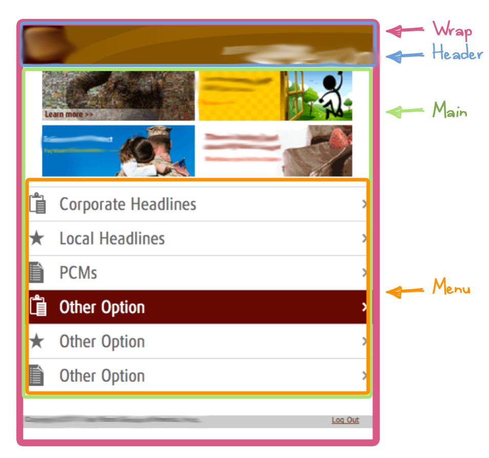
  • wrap (div)
  • header (div)
  • main (div)
  • menu list (ul)

I had to apply jQuery tags to my main containers in order to activate jQuery Mobile styles and transition effects. These containers look like this:

<div id="wrap" data-role="page">
<div id="header" data-role="header">
<div id="main" data-role="content">
<ul class="nicelist" data-role="listview">

After applying all “data-role” tags my home page looked like this:

<head>
            <title>Home</title>
<!-- // Meta for mobile devices -->
            <meta name="viewport" content="width=device-width, initial-scale=1">
<!-- // Custom CSS for web browsers: css/mobile.css -->           
    <link rel="stylesheet" href="css/mobile.css" media="screen" />
<!-- // jQuery Mobile CSS and JS -->               
<link rel="stylesheet" href="http://code.jquery.com/mobile/1.0/jquery.mobile-1.0.min.css" />            <script type="text/javascript" src="http://code.jquery.com/jquery-1.6.4.min.js"></script>            <script type="text/javascript" src="http://code.jquery.com/mobile/1.0/jquery.mobile-1.0.min.js"></script>
</head>
<body>
<div id="wrap" data-role="page">
            <div id="header" data-role="header">
                <!-- header elements -->
            </div><!-- /header -->
            <div id="main" data-role="content">
                        <!-- main elements -->
                        <div id="menu">
                                 <ul data-role="listview">
                                                <li class="option1"><a href=”#”>Corporate Headlines</a></li>
                                                <li class="option2"><a href=”#”>Local Headlines</a></li>
                                                <li class="option3"><a href=”#”>PCMs</a></li>
                                                <li class="option4"><a href=”#”>Other Option 1</a></li>
                                                <li class="option5"><a href=”#”>Other Option 2</a></li>
                                                <li class="option6"><a href=”#”>Other Option 3</a></li>
                                    </ul>
                     </div> <!-- /menu -->

            </div> <!-- /main -->
                <div id="footer">     
                                      <p>Copyright &copy; 2011, United Parcel Service of America, Inc. <a id="logout" href="#">Log Out </a></p>
            </div><!-- /footer -->
</div><!-- /wrap -->
</body>

You can find more about jQuery mobile tags and page templates here: http://jquerymobile.com/demos/1.0/docs/pages/page-anatomy.html

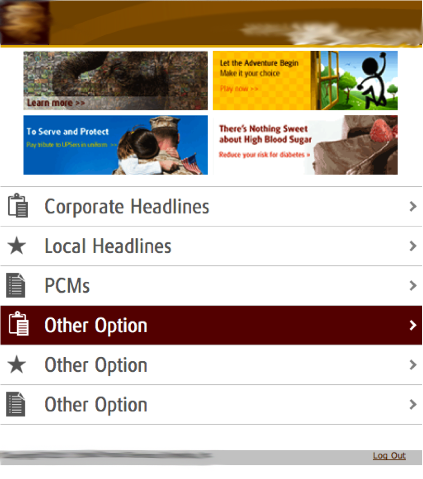
But the things were not just that easy at this point. When I added this framework to my site, all my stylesheets and all my original design were gone! The default jQuery Mobile style had owned my design styles.

Original design:
After applying jQuery Mobile framework:

Shocking, right? I did extensive research and couldn’t find anything that could help, so I just experimented with jQuery tags.

Finally, after ten thousand tests I noticed that some jQuery tags had to be removed in order to disable default jQuery Mobile styles and enable mines:

Now I have my element page containers like this:

<div id="wrap" data-role="page" >
<div id="header" data-role="header">
<div id="main" data-role="content">
<ul class="nicelist" data-role="listview">

I discovered if I removed all “data-role” tags from my containers, my original styles came back but I lost all the transition effects from jQuery. So I removed all “data-role” tags from all containers except in wrap container:

<div id="wrap" data-role="page" >
<div id="header">
<div id="main">
<ul class="nicelist">

And this was the result:

Excellent! But… The background is gray! This was not right and I found this trick of how to disable the default gray background from jQuery. You can create from scratch your own theme but I didn’t have the time (neither the mood), so here it is:

<div data-role="page" id="wrap" data-theme="f">

Let me explain it a little bit:

By default, jQuery has five style themes: a, b, c, d and e:

And you can choose any theme you like from these five. But, if you add a theme which doesn’t exist inside mobile jQuery framework, automatically all default visual styles disappear and, of course, the freaking gray background:

And voila! No more default theme styles from jQuery! So you can choose any theme name you want but all jQuery default themes: a,b,c,d and e. I chose “f”because was the logical next letter.

Now, talking about the transitions, the jQuery Mobile framework includes a set of six CSS-based transition effects that can be applied to any page link or form submission with Ajax navigation (http://jquerymobile.com/demos/1.0/docs/pages/page-transitions.html):

  • slide
  • slideup
  • slidedown
  • pop
  • fade
  • flip

By default, the framework applies the right to left slide transition. To set a custom transition effect, add the data-transition attribute to the link:

<a href="index.html" data-transition="pop">I'll pop</a>

In my case I just wanted the default slide transition effect to my links, so I had to do nothing. Just remember to put the data-role=”page” tag in the wrap container element from all the singles pages and will work like a charm!